MaiRe
Holdings
A refined corporate identity designed to communicate ambition, authority, and lasting credibility across every touchpoint from tradeshow stand to boardroom presentation.
The problem
MaiRe was operating with fragmented brand materials some formal, some casual, none coherent. The visual language wasn't reflecting the quality of the work being done. They needed a brand that matched their ambitions.
Creative direction
We built the identity around precision and restraint. A geometric shield mark authority made visual. A palette that reads as premium without being loud. Typography chosen to carry weight at both display and body size.
Outcome
A complete CI handover logo suite, colour system, typography specs, stationery, exhibition stand concepts, outdoor branding, and brand guidelines. An identity that gives MaiRe the confidence to present at any level.
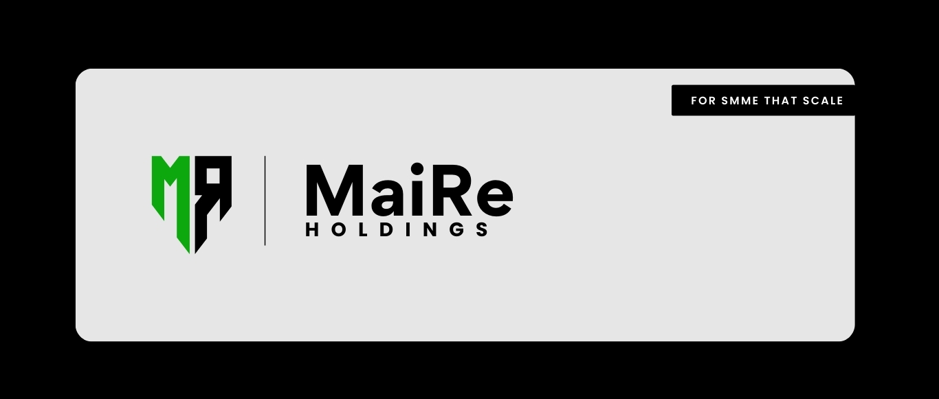
A shield built from geometry. Authority made visible.
The MaiRe mark is constructed from two interlocking initials M and R formed into a downward shield. The negative space isn't decoration; it's structural. Every angle was deliberate.
The two-tone green-and-black split communicates duality: the corporation and the community it serves. Growth and groundedness, held in the same form.
Colour systemGreen that earns its place. Black that holds the room.
The palette avoids the corporate trap of playing it safe. A vivid mid-green carries energy and forward motion. Pure black provides gravitas. Neither overpowers they work in tension, and that tension is the brand.
Tagline"For SMME that scale."
Six words that do a lot of work. It positions MaiRe clearly not a generic holding company, but a partner built specifically for small and medium businesses with growth ambitions. The tagline appears on all primary touchpoints.
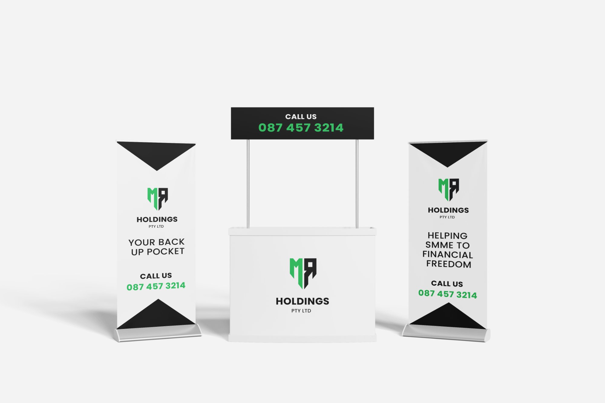
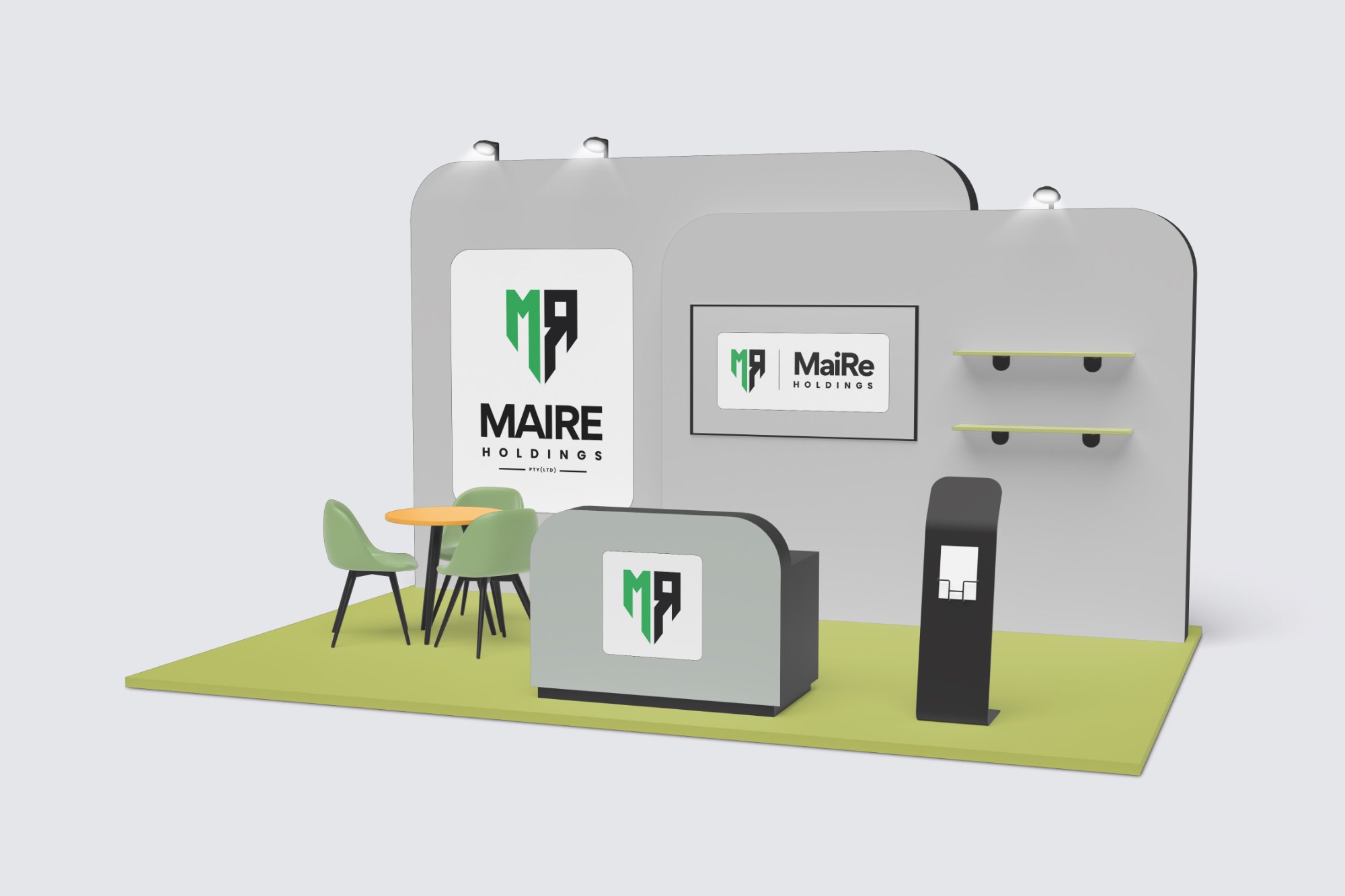
The rollup banner system was designed for maximum field impact bold logo presentation at the top, clear messaging in the body, and the call-to-action number given full prominence.
Three pieces work as a unit: two flanking banners and a central counter create an immediately professional event footprint, regardless of venue size.
"Your Back Up Pocket."
"Helping SMME to Financial Freedom."
Two lines. Each carries the brand's entire promise. They were stress-tested against competitors' messaging and sharpened until they had no fat left.
Primary + variants
Shield mark, horizontal lockup, and wordmark-only variants. Delivered in SVG, EPS, PNG (dark, light, and green versions) for every use case.
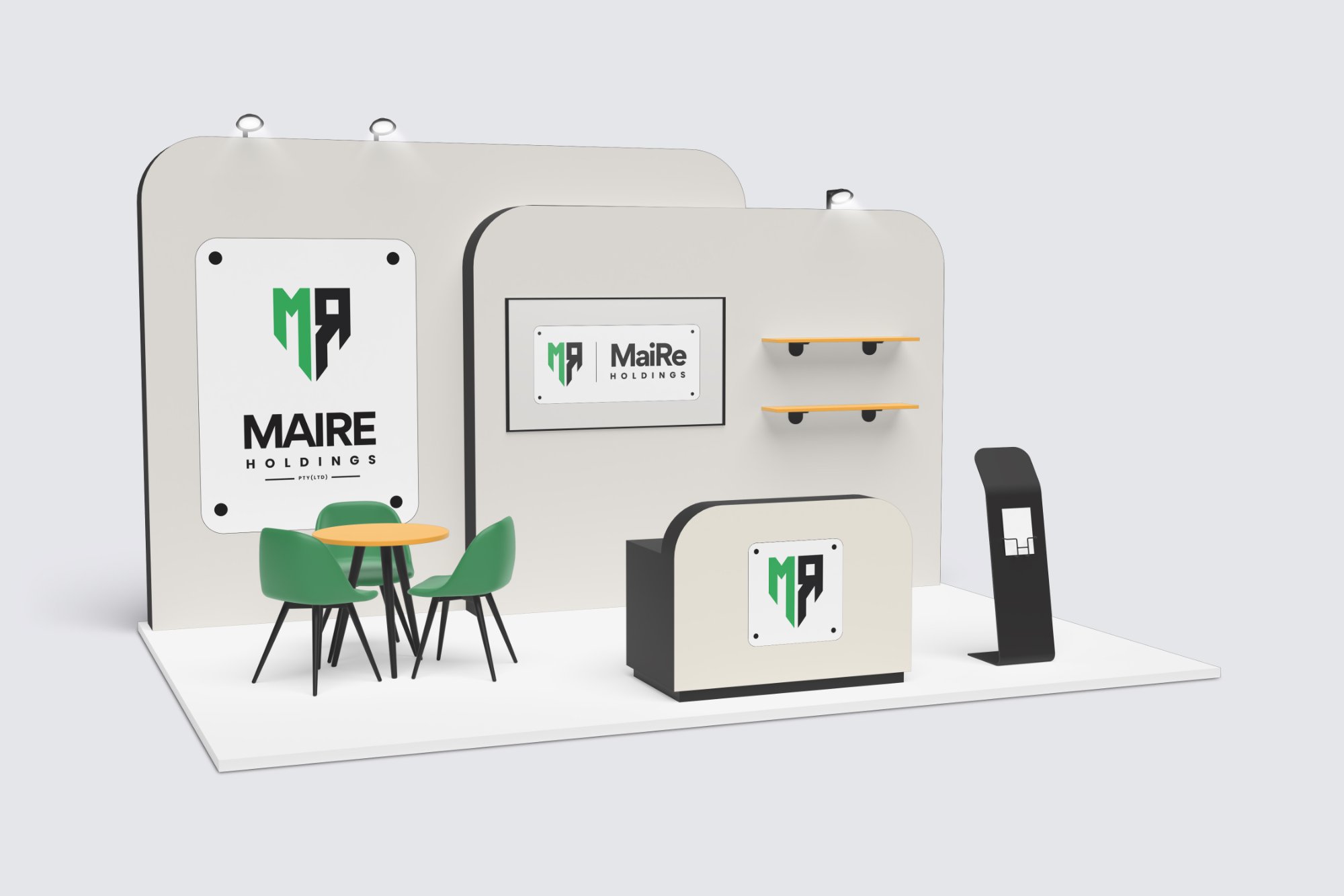
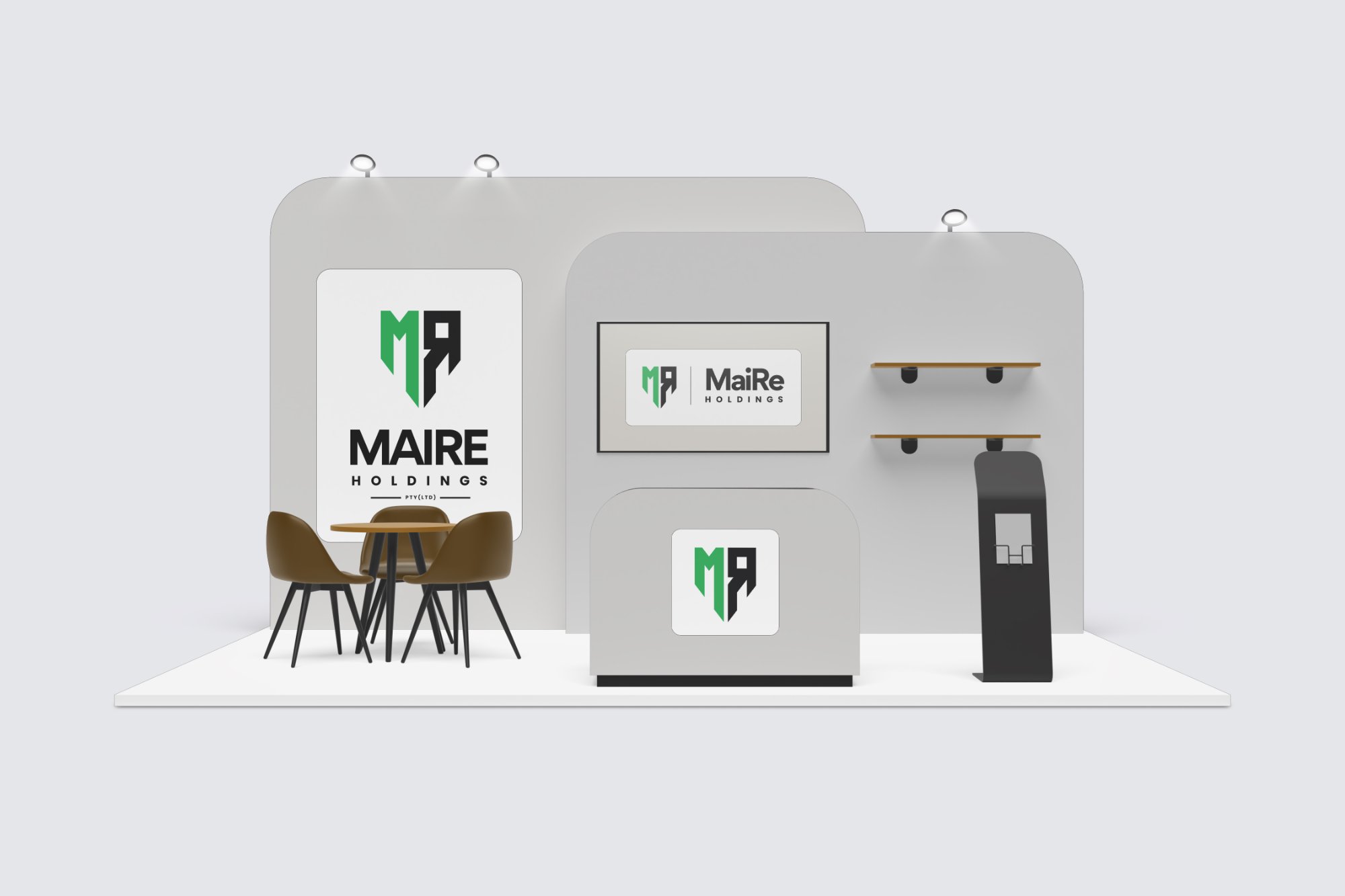
Three concepts
Full 3D visualisations of three stand configurations each adapting the identity to a physical event space with backdrop panels, counter branding, and collateral displays.
Rollup system
Matched rollup banner pair plus promo counter print-ready at correct dimensions with bleed, designed for maximum brand clarity at distance.
Your brand deserves
to command the room.
Whether you're entering a new market or repositioning for scale let's build an identity that carries your weight in every room.