Fofo
Wellness
A brand built on restraint. Where others shout, Fofo Wellness holds its ground, a minimal identity rooted in clarity, calm, and emotional honesty. The silence is the strategy.
The problem
The wellness space is loud, overcrowded, and trend-driven. The client needed an identity that stood apart: calm, credible, and built to last. Not another green-leaf logo. Something felt, not just seen.
Creative direction
Strip everything back. A monochrome base with colour variants for flexibility. A contained symbol: leaf nested in circle, growth anchored in balance. Every decision reinforces quiet confidence, not urgency.
Outcome
Full Brand CI: logo system across variants, typography, social templates, packaging mockups, and app persona direction. 12+ deliverables. A brand that looks as mature as its values.
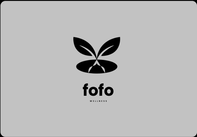
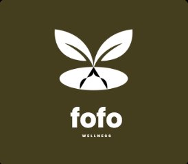
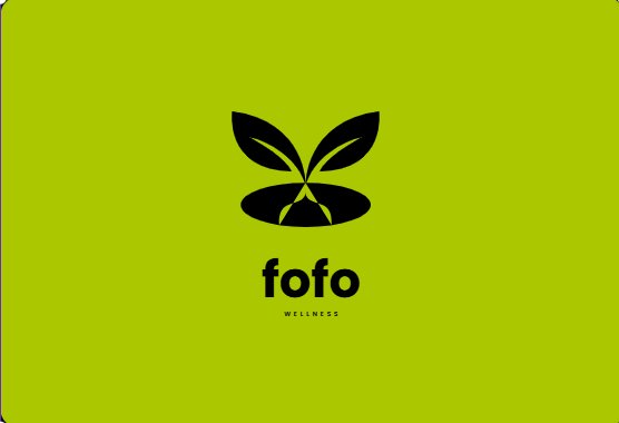
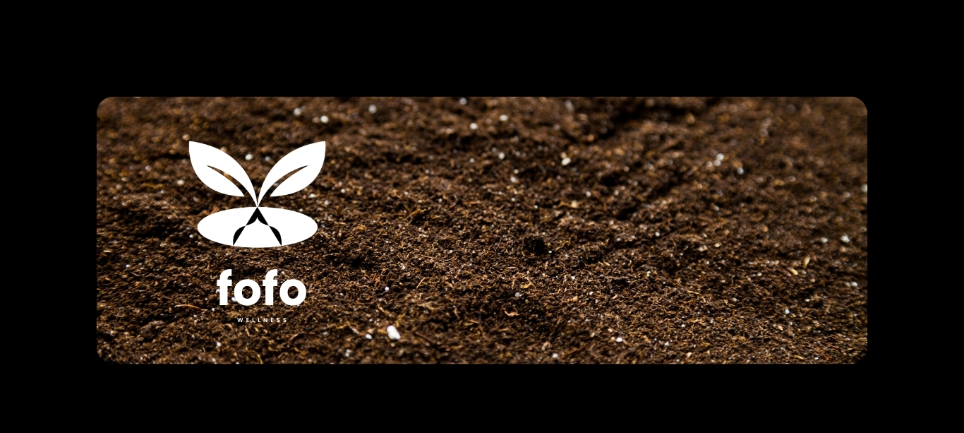
Growth anchored by balance
A leaf nested in a circle. The symbol carries both ideas simultaneously: the leaf signals life and renewal; the oval grounds it in permanence and stability. Together they form something that feels complete, not clever.
The negative space inside the mark was as considered as the form itself. What isn't there matters as much as what is. The icon scales without losing integrity, from app icon to billboard.
The wordmark was set in geometric sans at custom weight, authoritative at a glance but never loud. Lowercase throughout, because the brand's tone is approachable, not prescriptive.
Five ways to say the same thing
The core palette is monochrome: pure black and white. But the brand needed flexibility across contexts, so a variant suite was built: teal-grey for clinical environments, earth-brown for natural-product contexts, lime-green for high-energy activations.
Every variant holds the same typographic and spatial rules. Colour changes the mood, not the message, giving Fofo Wellness a family of identities that are unmistakably the same brand, speaking different dialects.
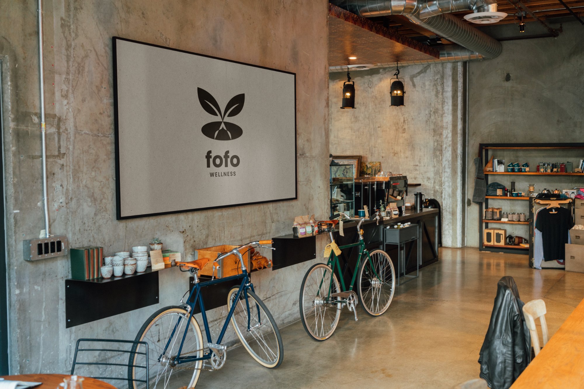
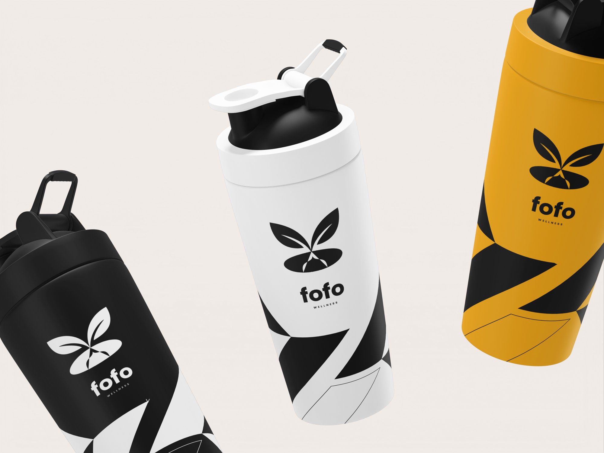
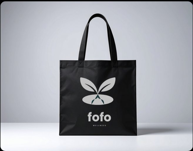
From mark to material
The identity was tested across every touchpoint: packaging, merchandise, apparel, and digital surfaces. Not one was an afterthought. Each application was designed to feel like the brand made it, not that it was placed on it.
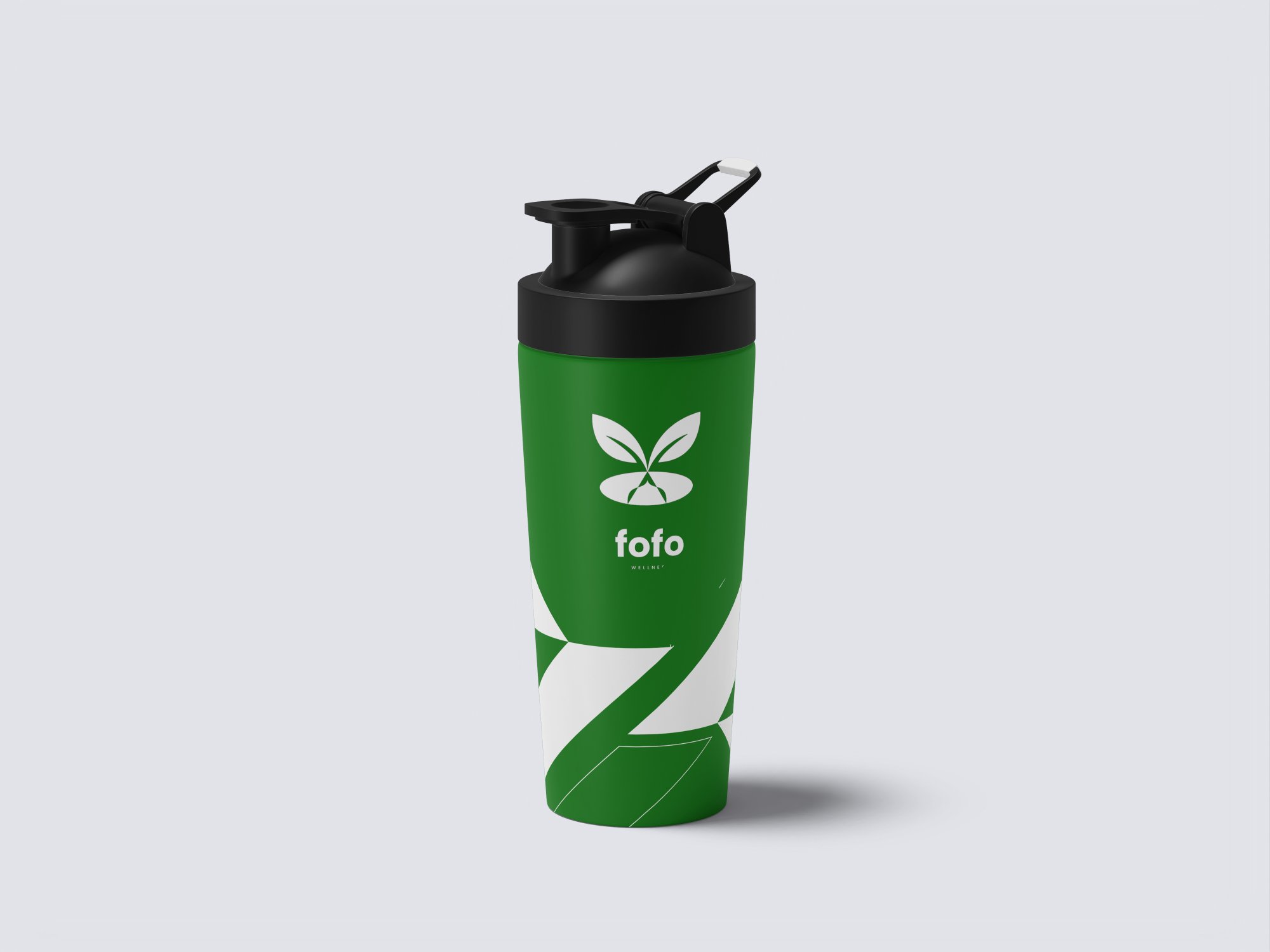
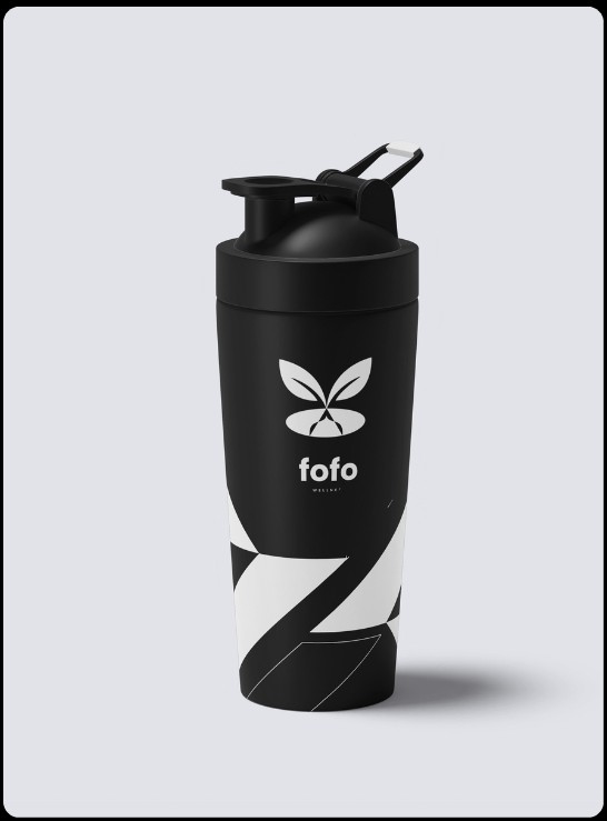
The bottle and bag are anchor products: premium, minimal, and quietly desirable. The squeeze bottle in monochrome is the brand's personality made physical, functional, restrained, and distinctive on a shelf.
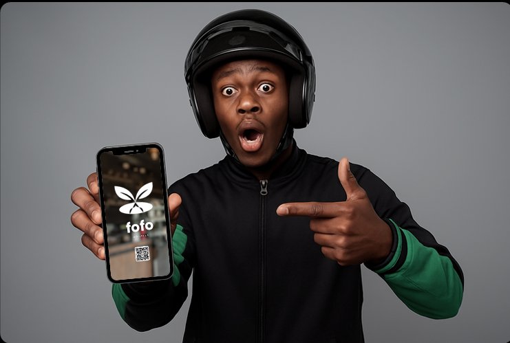
The fofo man (delivery persona) extends the brand into lifestyle territory, confident, urban, and grounded. This opened a social storytelling lane the original brief didn't anticipate.
Full gallery
Click any image to view at full size
Ready to build something?
Your brand deserves
to feel this way.
Whether you're starting from scratch or elevating what you have, let's build an identity that means something.