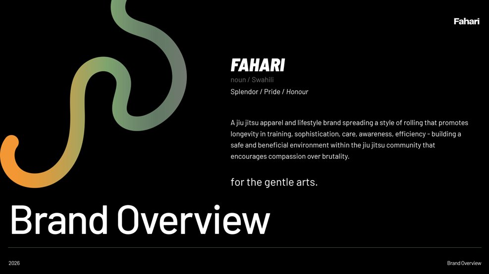
Fahari
Apparel
Jiu-jitsu apparel built on sophistication, longevity, and discipline. Identity systems designed for the mat and the world beyond it.
The brief
Fahari needed an identity that could sit alongside premium streetwear while speaking to a serious jiu-jitsu community. Clean, technical, and rooted in Swahili meaning: Splendor, Pride, Honour.
Direction
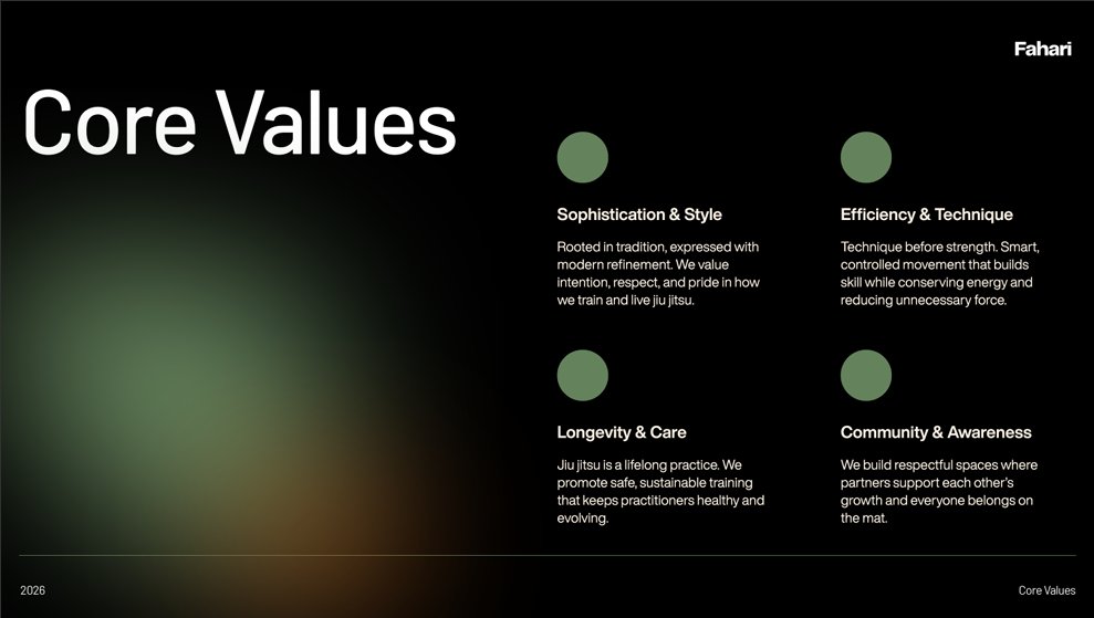
We built across four core values: Sophistication, Efficiency, Longevity, and Community. Every visual decision flows from these pillars, from the geometric mark to the apparel typography system.
Outcome
Full brand CI: logo system and variations, type application suite, apparel mockups across two product lines, colour palette, and brand overview deck. A brand ready to roll.
Geometry meeting tradition
The Fahari mark is a geometric diamond form built from interlocking rounded curves. It references the guard position of jiu-jitsu while functioning as a clean, modern symbol that holds at every scale.
Two executions were developed: the primary icon mark for branding touchpoints, and the bold wordmark for apparel applications where visibility and impact take priority over subtlety.
Both live in monochrome and adapt across light and dark surfaces, giving the brand full flexibility across garments, digital platforms, and print collateral.
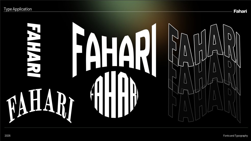
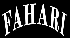
Five ways to wear the name
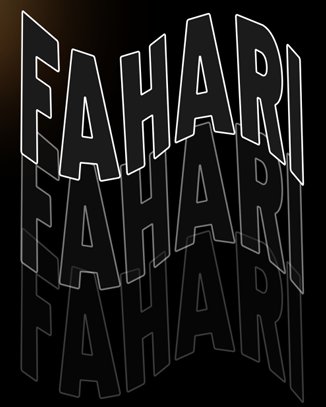
Typography in performance apparel is architecture. Each typeface variant serves a distinct placement purpose: the curved arch for back yoke, the condensed stack for sleeve runs, the bold outline repeat for allover prints.
The arc treatment directly references the tradition of martial arts branding while the perspective-distorted repeat is pure energy. Both live inside the same system without conflict.
Earthy, bold, and built to print
Seven supporting and print colours anchor the Fahari palette: forest green, burnt orange, dusty rose, deep burgundy, steel teal, pale lemon, and acid lime. Each was chosen to print cleanly on performance fabric and photograph well in field and studio environments.
Four gradient transitions were defined for digital use, promotional assets, and premium product lines where the brand needs to show range without losing cohesion.
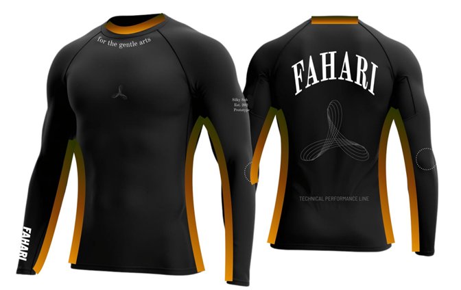
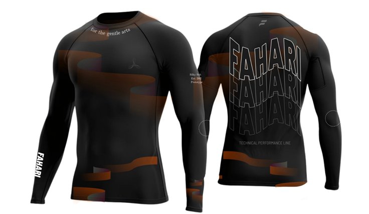
Where identity meets the mat
Two rashguard designs anchor the debut performance line. The first uses gold side-panel detailing with the arched FAHARI back treatment, clean and competition-ready. The second is the earth camo edition: tonal brown camouflage panels with the perspective-distorted allover type system.
Both carry the tagline "for the gentle arts" at the chest, the F icon on the left sleeve, and "Technical Performance Line" at the rear hem. Consistent placement rules were documented so future colourways maintain brand integrity.
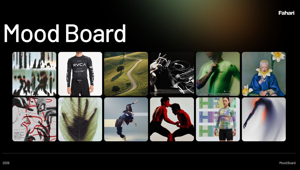
Full gallery
Click any image to view at full size

Ready to build something?
Your brand deserves
to stand out.
Whether you're building from scratch or elevating an existing identity, let's create something that means something.